Change from Loader Image to Loader Progress
Scenario
You want a custom spinner instead of the default loader icon, and you need users to see numeric or textual progress while the document loads across Vue PDF Viewer:
- When the Vue PDF component starts loading, the library displays the loader progress.
- When a PDF document starts loading, the loader progress is displayed on the layout.
- When a PDF page starts loading, the loader progress is displayed on the page.
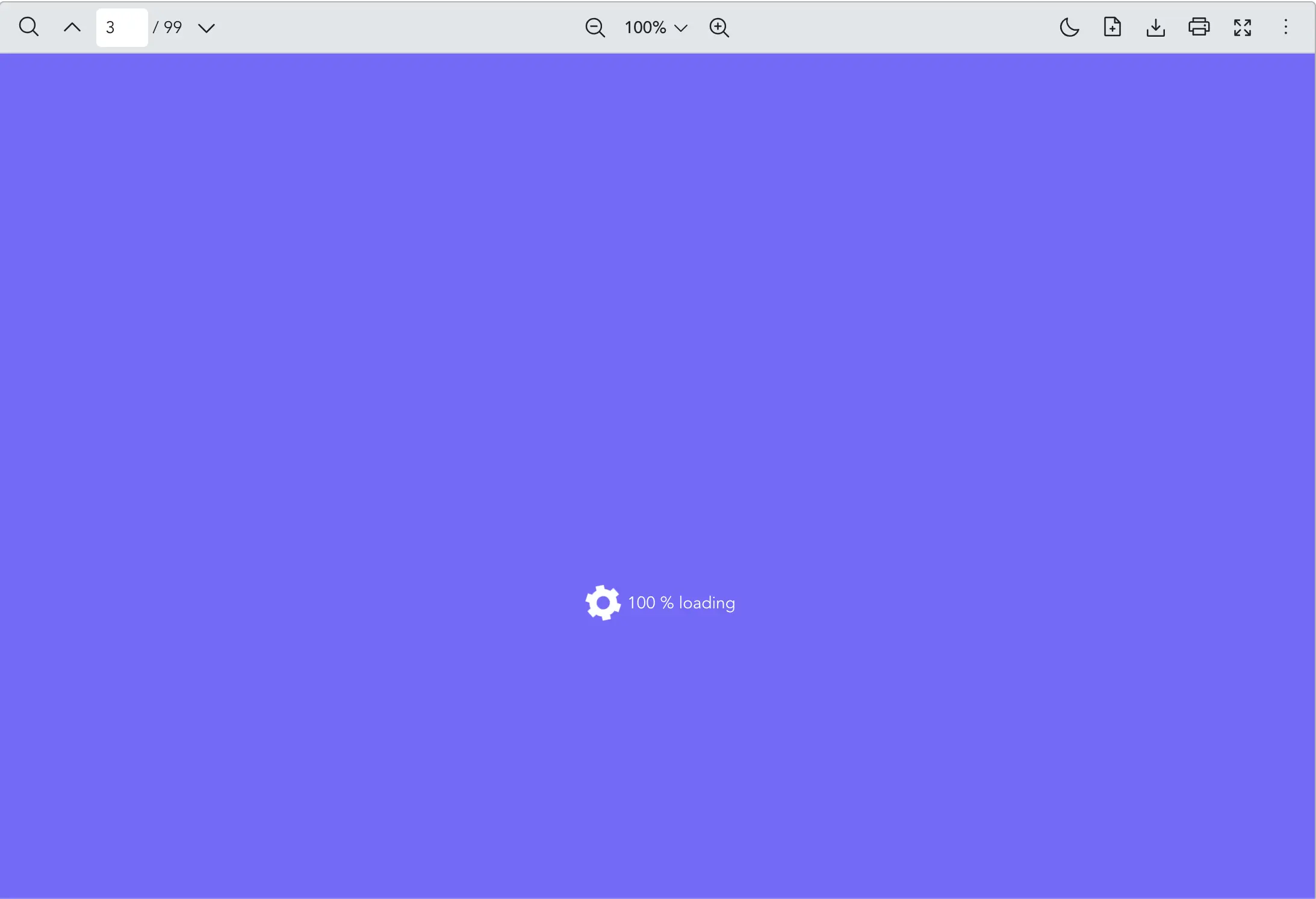
What to Use
Use the src prop from VPdfViewer to load a PDF file. To swap the default spinner graphic with your own progress label or layout when the document loads, use the loaderImage and loaderProgress props respectively.
| Prop | Objective |
|---|---|
loaderImage | Provide a custom loader image element to display while the PDF document is loading. Replace the default loading animation. |
loaderProgress | Provide a custom loader progress content (e.g. text or percentage) while the PDF document is loading. Replace the default loading animation. |
vue
<template>
  <VPdfViewer
    src="https://raw.githubusercontent.com/mozilla/pdf.js/ba2edeae/web/compressed.tracemonkey-pldi-09.pdf"
  >
    <template #loaderImage>
      <!-- you can use image or svg tag -->
      <svg
        width="40px"
        height="40px"
        xmlns="http://www.w3.org/2000/svg"
        viewBox="0 0 200 200"
      >
        <path
          fill="white"
          stroke="white"
          stroke-width="15"
          transform-origin="center"
          d="m148 84.7 13.8-8-10-17.3-13.8 8a50 50 0 0 0-27.4-15.9v-16h-20v16A50 50 0 0 0 63 67.4l-13.8-8-10 17.3 13.8 8a50 50 0 0 0 0 31.7l-13.8 8 10 17.3 13.8-8a50 50 0 0 0 27.5 15.9v16h20v-16a50 50 0 0 0 27.4-15.9l13.8 8 10-17.3-13.8-8a50 50 0 0 0 0-31.7Zm-47.5 50.8a35 35 0 1 1 0-70 35 35 0 0 1 0 70Z"
        ></path>
      </svg>
    </template>
    <template #loaderProgress="{ progress }">
      <div style="color: white">{{ progress }} % loading</div>
    </template>
  </VPdfViewer>
</template>

<style scoped>
/* to replace the default mask color */
:deep(.vpv-variables) {
  --vpv-loader-backdrop-color: #7862ff;
  /* if you want to change the animation, you may set the name of "--vpv-loader-animation-name" css variable */
}
:deep(.vpv-variables.vpv-variables__dark) {
  --vpv-loader-backdrop-color: white;
}
</style>
Notes
- Dark theme: The example above adjusts
--vpv-loader-backdrop-colorfor.vpv-variables__darkwhen using dark mode variables.